HirokoTruscott
A designer who listens first, then designs. I bring empathy and observation from a nursing background into product work — focused on simple, instinctive, and user-centred experiences for startup teams.

Work projects
2023-2026MyDosh
Finance.
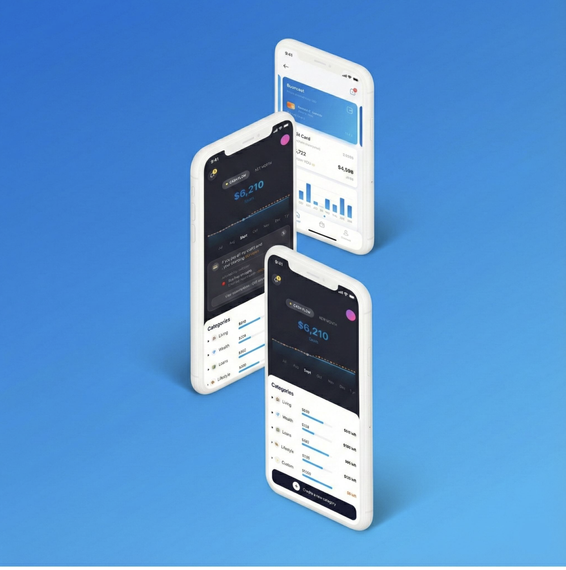
A personal finance companion redefining how a new generation builds clarity and control over their money — designed from research, not assumption.
Role
UX / UI - Product
Year
2023 - 2024
Sector
FinTech
What do users
really need from
their finances?
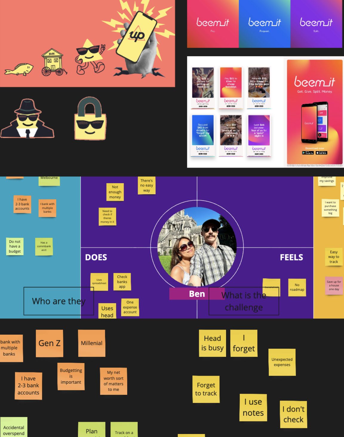
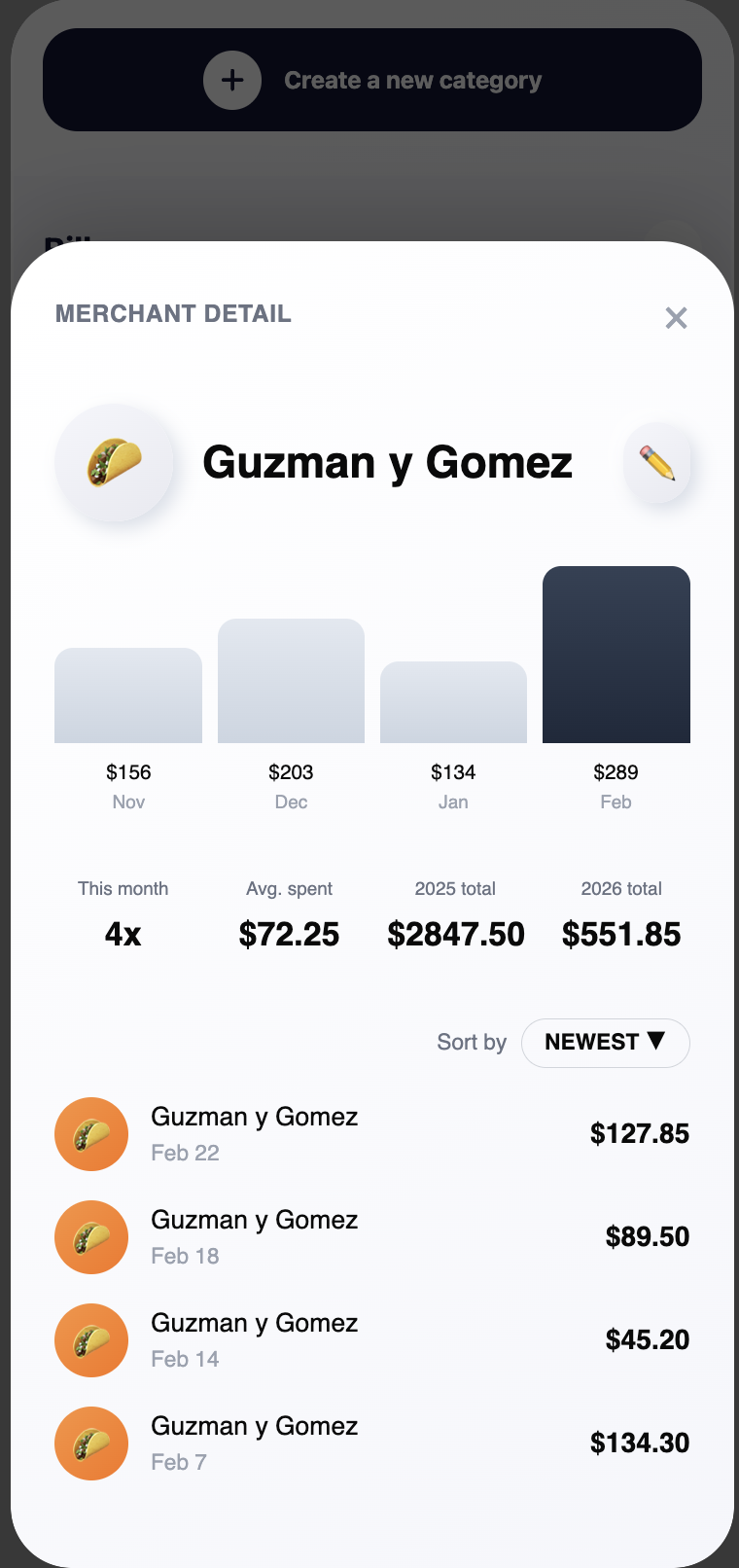
We were asked to develop a solution that merges modern tech with design-first thinking — making personal finance management not just easy, but accessible. The aim: empower a new wave of users to take control of their finances effortlessly.
Our first challenge was the most important one to get right: what are users actually looking for when it comes to controlling their money?
Every Asset
in Your Hands.
Cash became credit cards, and credit cards became digital wallets like Apple Wallet. As money itself continues to evolve into a more digital experience, user research revealed a growing shift in what people truly want from financial management today.
Exploration Phase
Initially, the focus was on exploring the concept as a web application. However, deeper research uncovered a broader behavioral shift across generations: people now spend a significant portion of their daily lives on mobile devices. At the same time, many users expressed a shared concern — they want to build wealth more intentionally for their future, but often feel overwhelmed, uncertain, or unsure about where they should begin.
Limitations
Many existing financial platforms allowed users to visualize parts of their assets in one place, but understanding how to properly manage or grow those assets still required professional financial advice. Although Australia has adopted an open banking system, there were still clear limitations in comprehensively managing all forms of personal finance, including student loans, debts, liabilities, and long-term financial planning.
Brightened by AI Technology
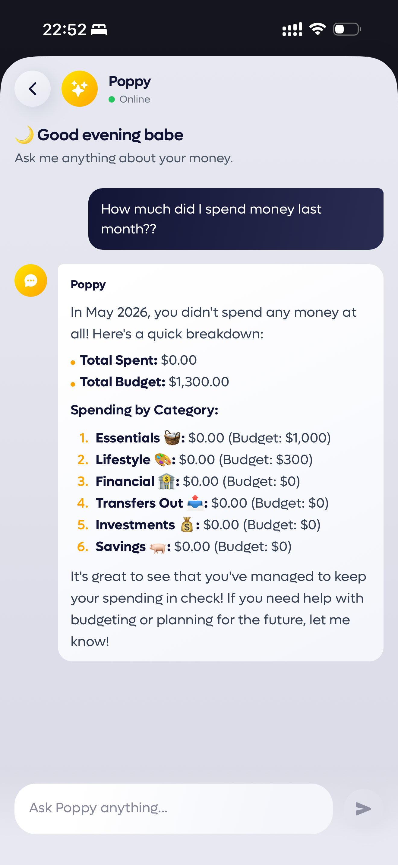
AI technology is evolving at an extraordinary pace, and by integrating emerging AI technology into financial experiences, it becomes possible to create platforms that are intuitive, accessible, and capable of delivering increasingly accurate financial insights over time. As the intelligence behind these systems continues to evolve, users are empowered to make smarter, more confident financial decisions.
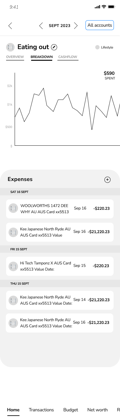
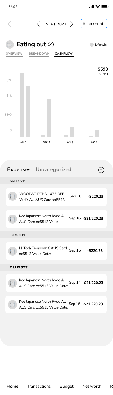
Wireframe and early concept

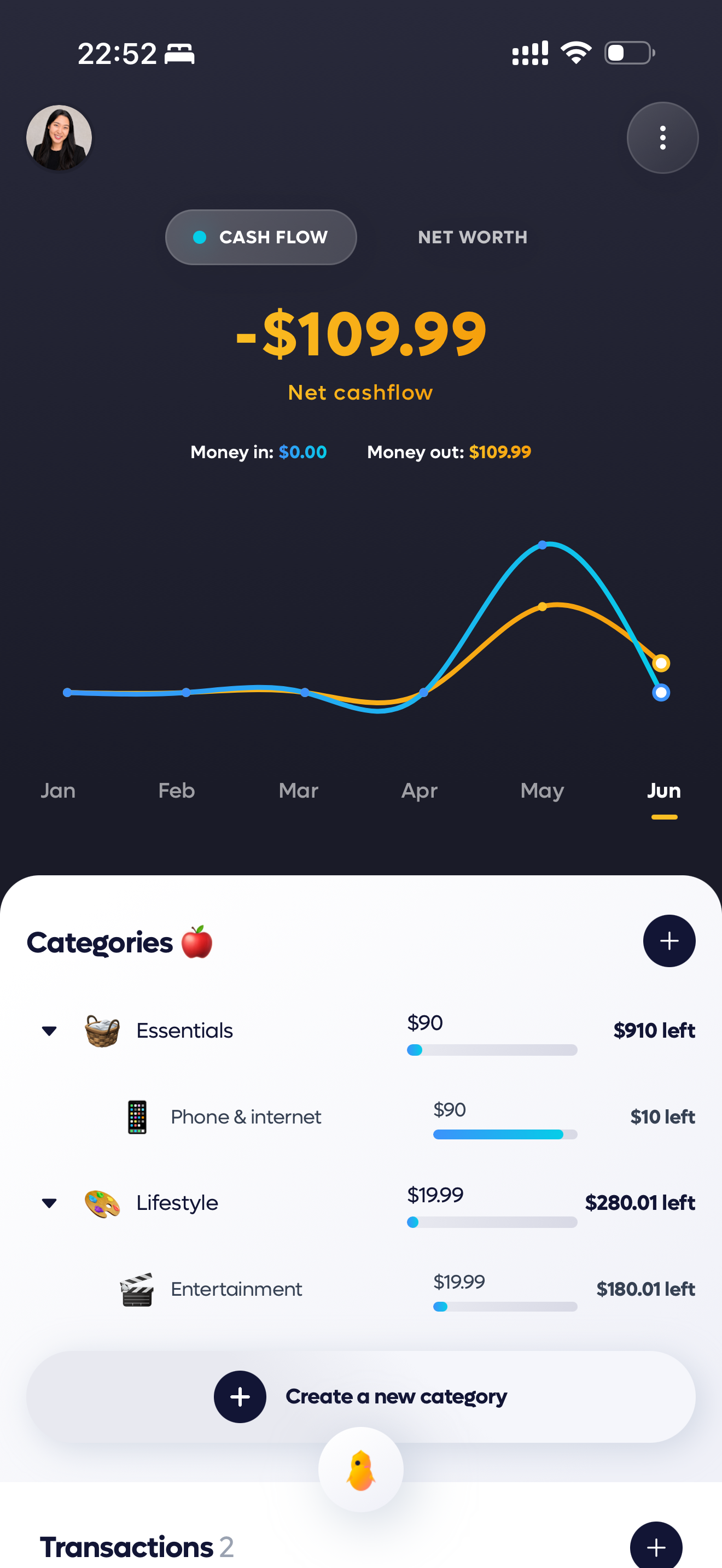
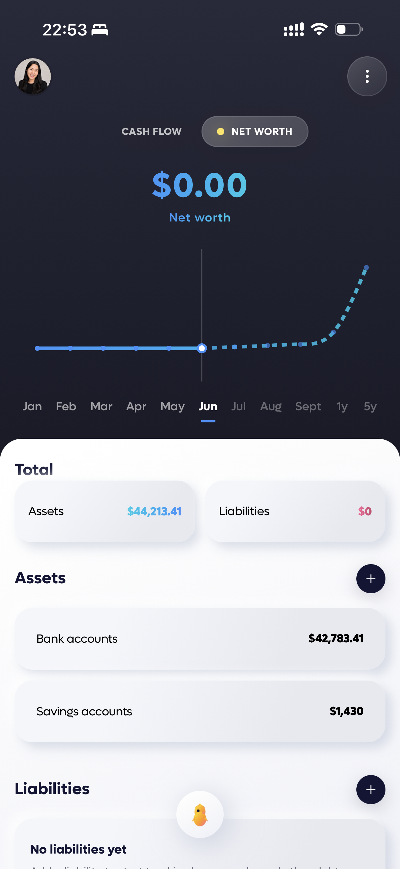
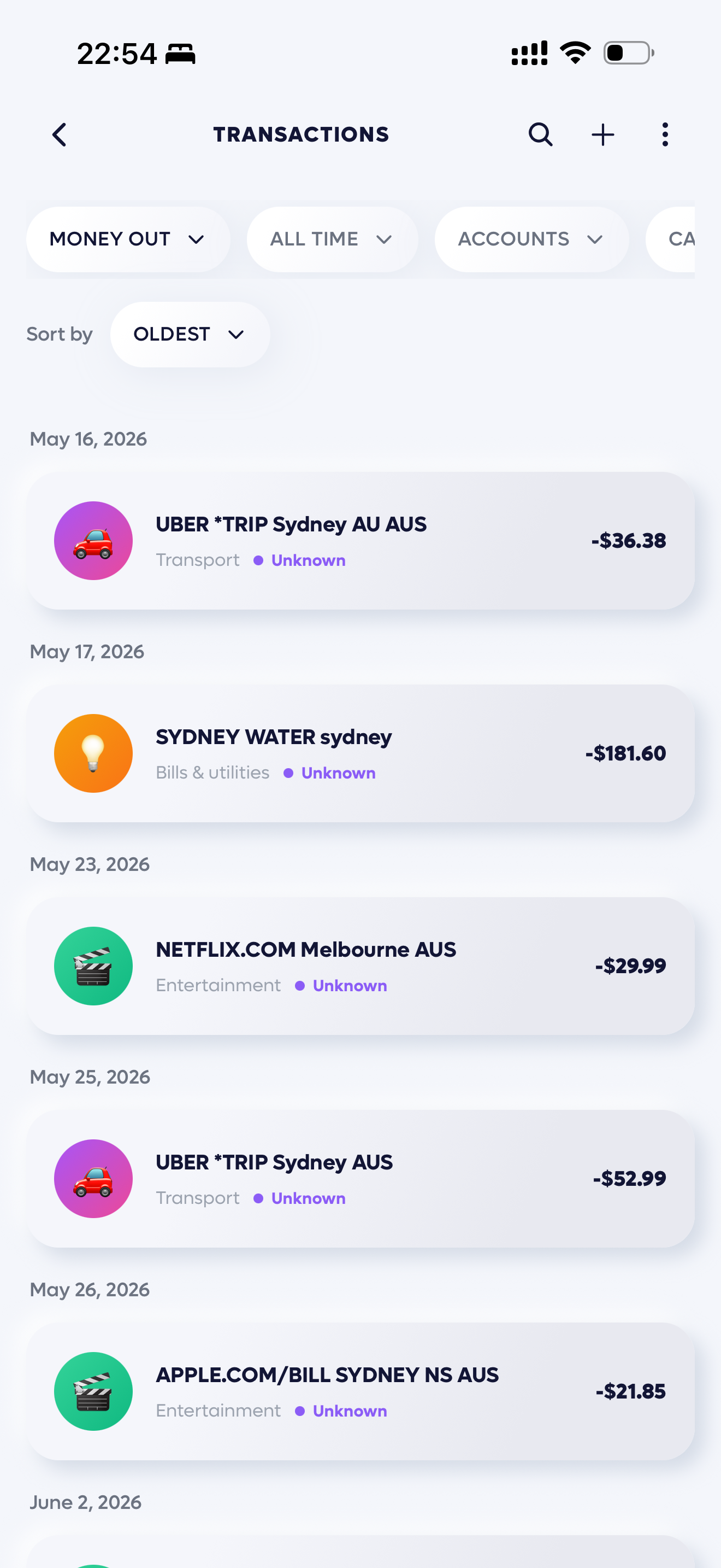
Final
interface.
Designing for
adaptability.
The design and functionality are still continuously evolving through ongoing iteration and refinement. We're constantly exploring ways to improve the experience and create a product that feels more intuitive, useful, and meaningful for users.
We look forward to continuing the development process and bringing the final product to market with a thoughtful and user-centered experience.
Axion
Multi-AI chatbot
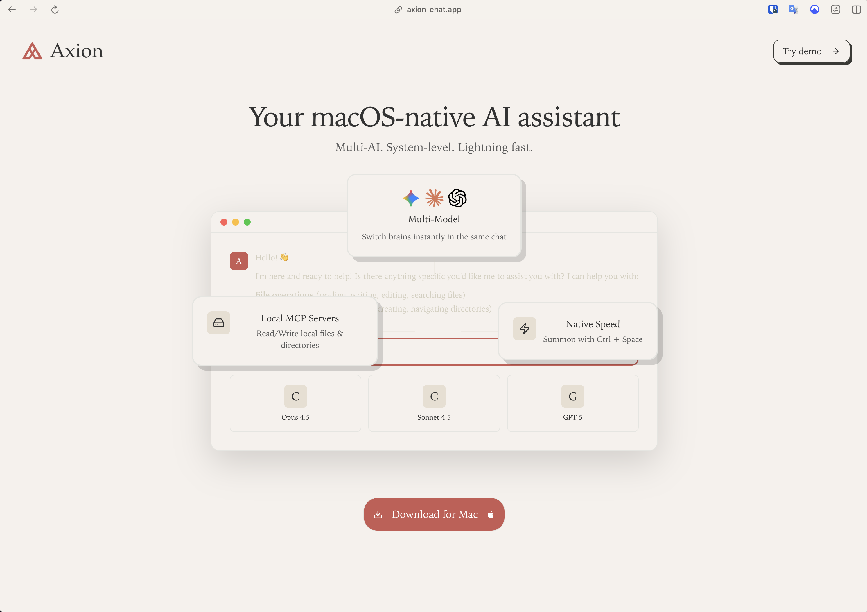
As the world continues to adapt to a new AI-driven era, the way people work is rapidly evolving alongside it. In this changing landscape, the ability to work faster, smarter, and more efficiently has become increasingly important.
Role
PRODUCT
Year
2025
Sector
AI CHAT_BOT
AI Research
Intentionally not for everyone, savior for developers
As we continue moving deeper into the age of AI, new models and technologies are emerging at an unprecedented pace. This project was inspired by the idea of helping people stay connected to the forefront of innovation — making it easier to access the latest developments in the MCP ecosystem and use AI tools as naturally and efficiently as an extension of their everyday workflow.
The goal was to create a product experience that feels simple, intuitive, and adaptable within a rapidly evolving technological landscape.
The Right Tools
for the Right People
As AI becomes increasingly integrated into everyday life and work, most products are designed for broad audiences with generalized functionality. However, software developers remain one of the most active and AI-native user groups.
This project was built on the belief that there is significant value in creating an AI experience specifically tailored to developers, addressing their unique workflows and needs within a rapidly growing market.
Who is the target?
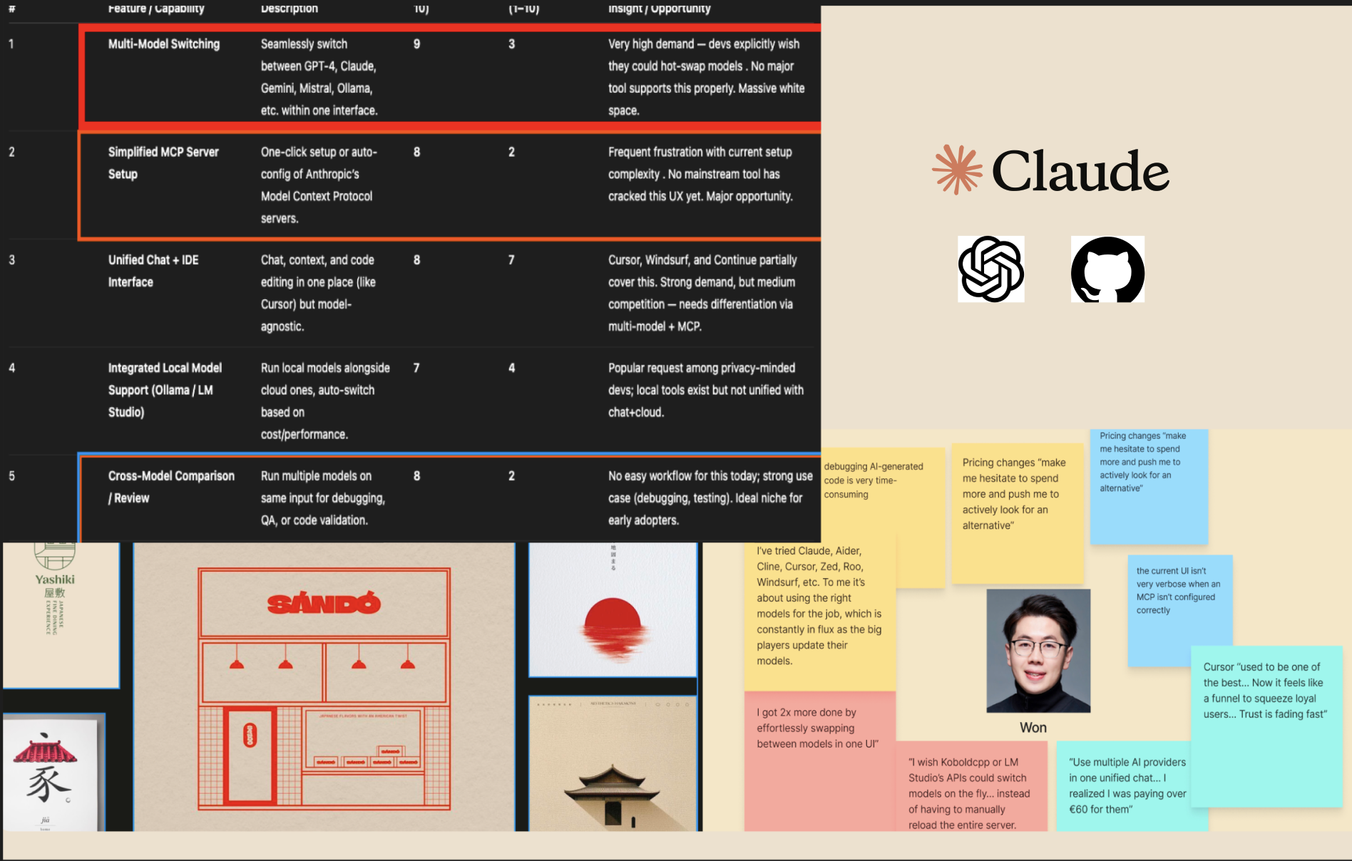
Initially, the product was designed to appeal to both niche and mainstream users. However, research revealed a clear gap between our vision and the needs of a broader audience. Rather than competing as another general AI tool, we chose to focus on a specific user group, creating a more specialized experience that remains underserved in the current market.
What's painpoint at the moment
After narrowing the target audience to developers, we explored their needs and everyday pain points. Research revealed that while developers spend most of their day in front of screens and are comfortable working with complex code, many experience fatigue from high-contrast interfaces and overly technical visual designs. This insight highlighted an opportunity to create an experience that feels not only productive, but also calming, comfortable, and visually refreshing throughout long working sessions.
How make good impress and addaptable design
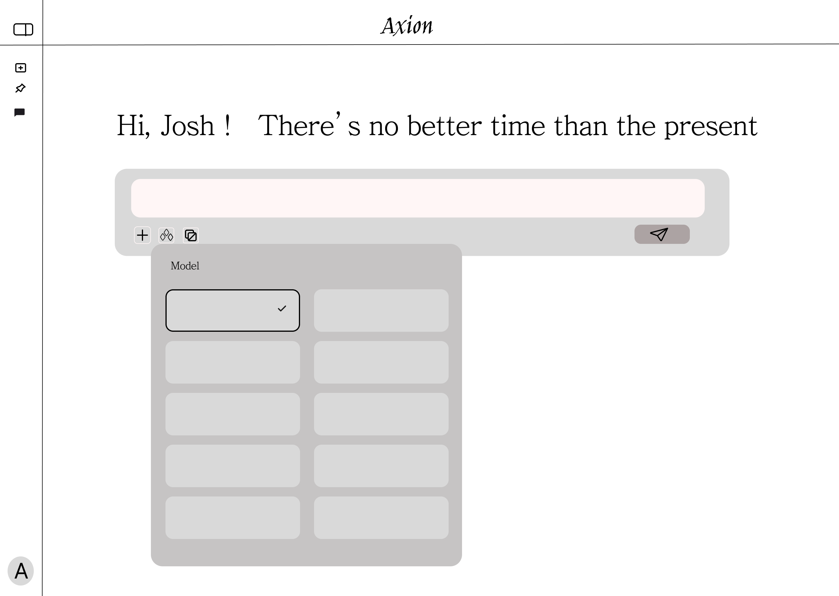
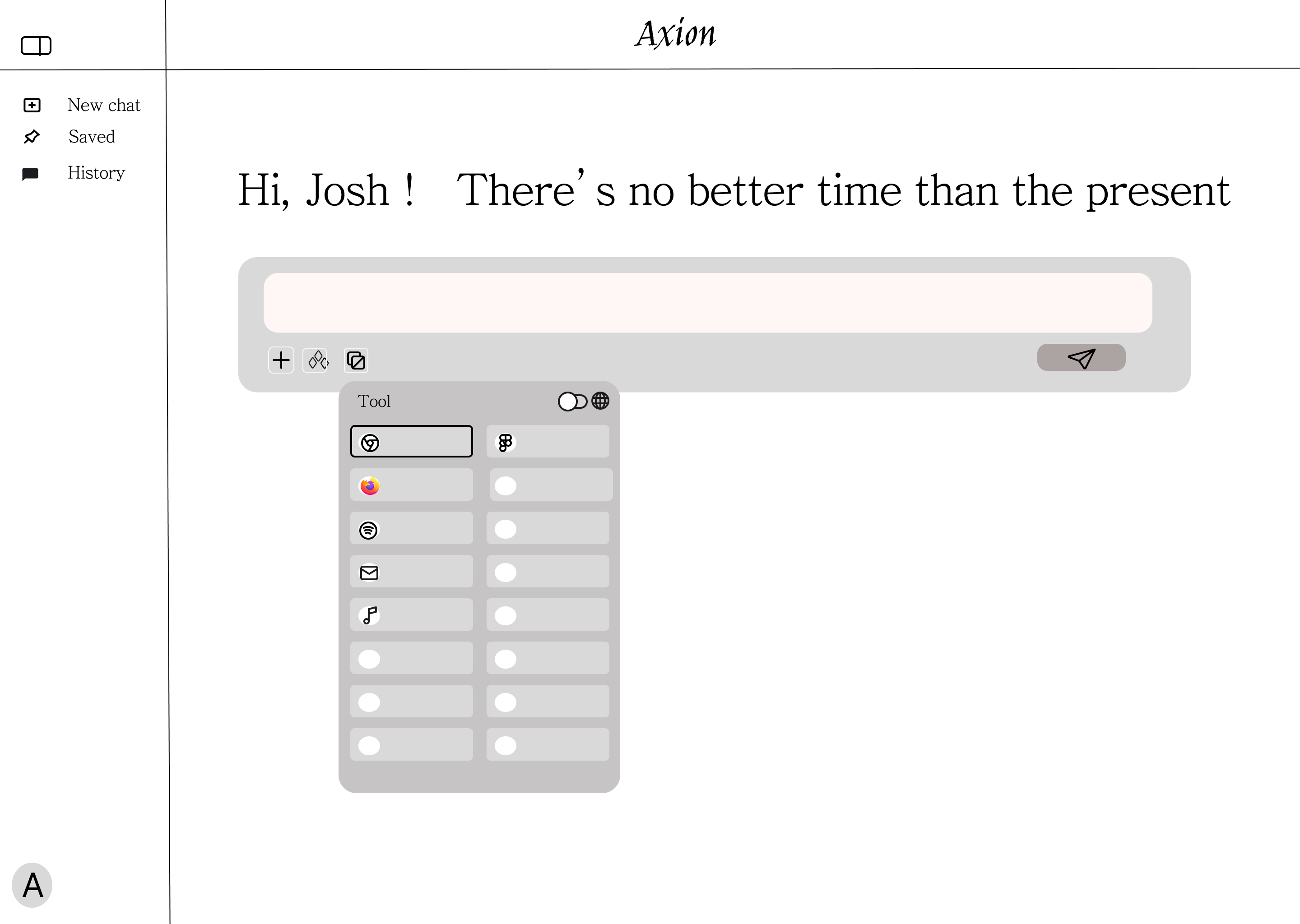
By integrating the foundational framework for MCP support, we created a more flexible and efficient workflow for a wide range of developers. Whether building custom MCP servers, leveraging existing integrations, or using external tools to streamline daily tasks, the platform is designed to adapt to diverse working styles and technical needs. Alongside functionality, careful attention was given to color, contrast, and visual hierarchy to create a calm and approachable interface—balancing powerful capabilities with a comfortable and intuitive user experience.
Wireframe and early
concept
Model Selection
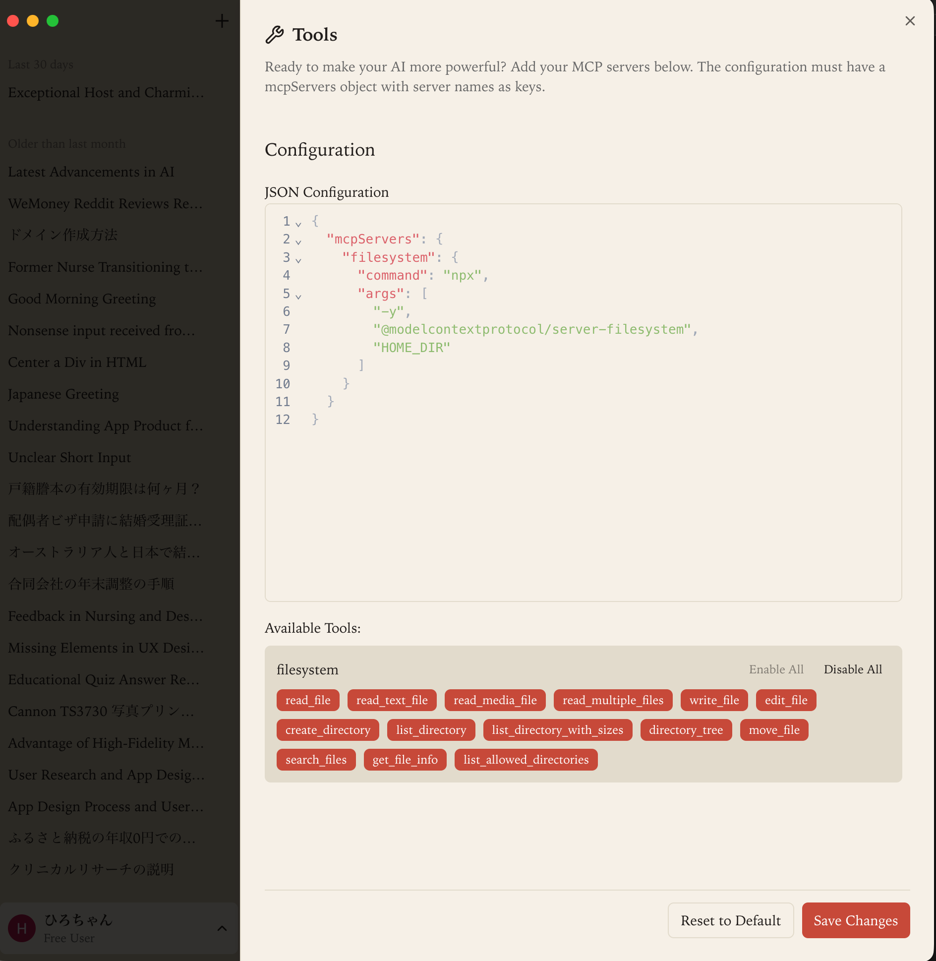
Tools Configuration
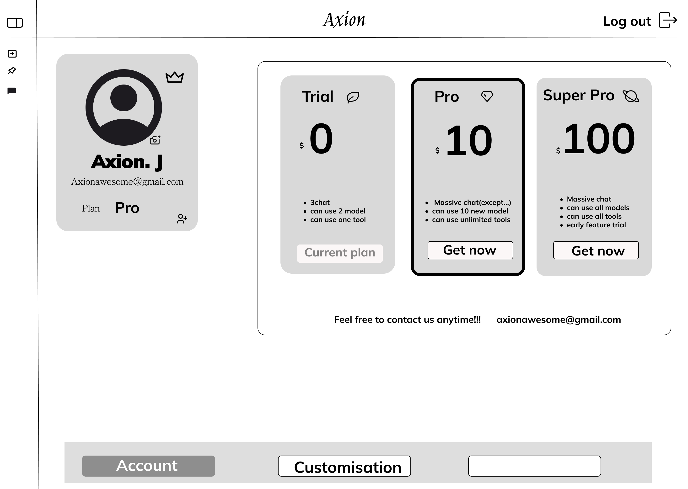
Pricing & Account
Final
interface.
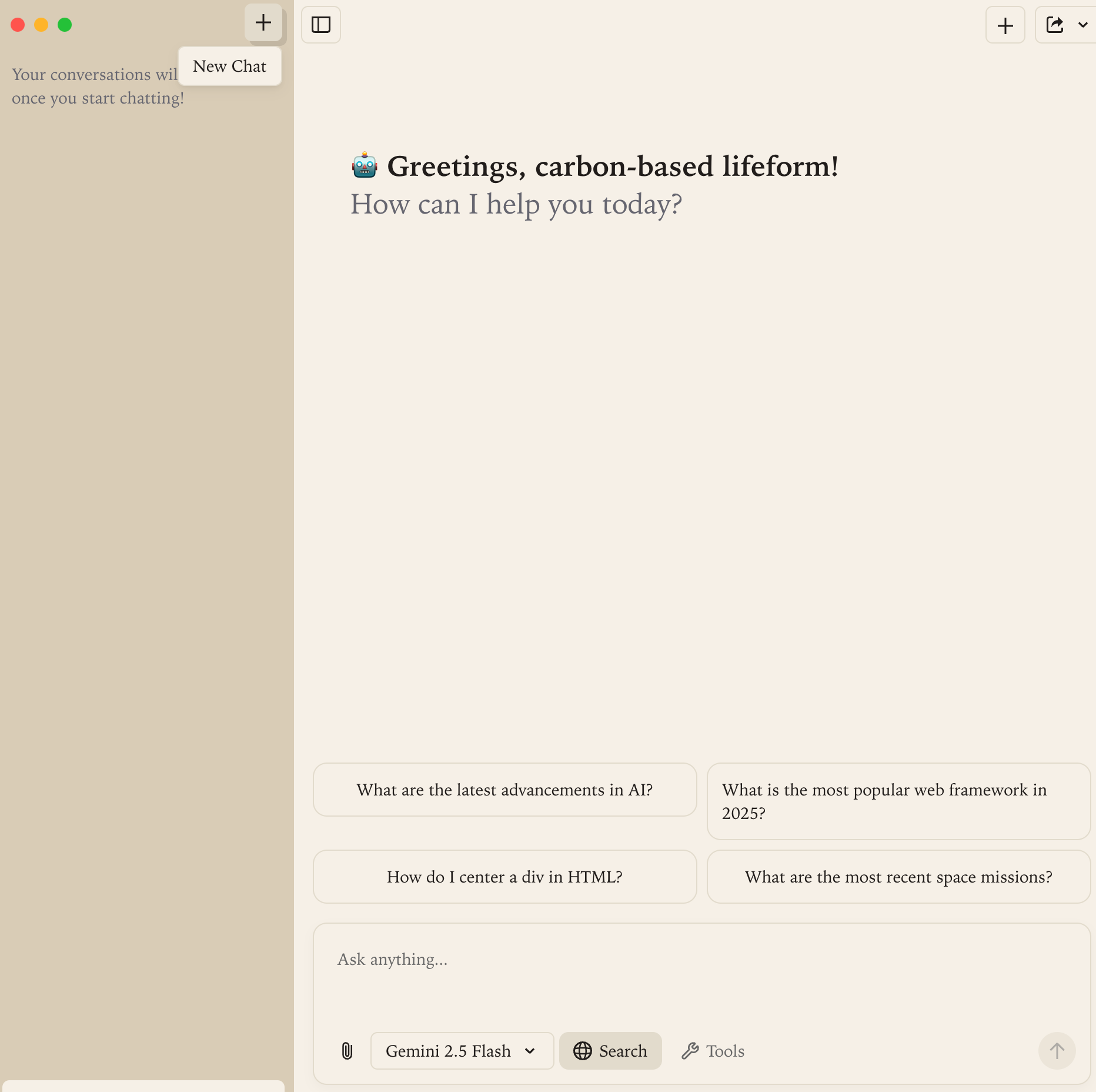
Product Demo
Welcome Screen
Tools Configuration
Try it now
Keep improving
for users.
This project ultimately evolved into a highly focused product experience, targeting a niche user group while strongly emphasizing the specific needs and characteristics of that audience through a simple, approachable, and intuitive design language.
At the same time, the integration of AI-driven technologies significantly accelerated the product development process — enabling rapid ideation, iteration, and progression from initial concept exploration through to launch within a remarkably short timeframe. We remain committed to continuously refining and evolving the product experience, with an ongoing focus on delivering meaningful improvements and long-term value to users.
Medishare
Healthcare.
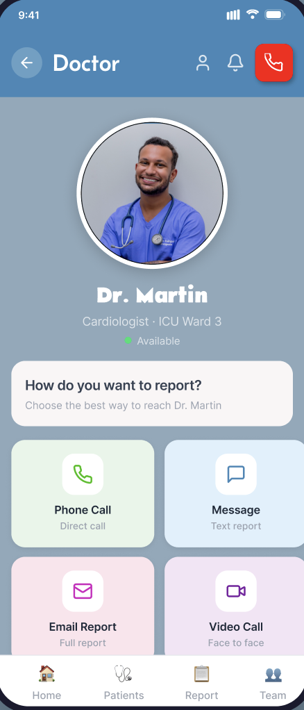
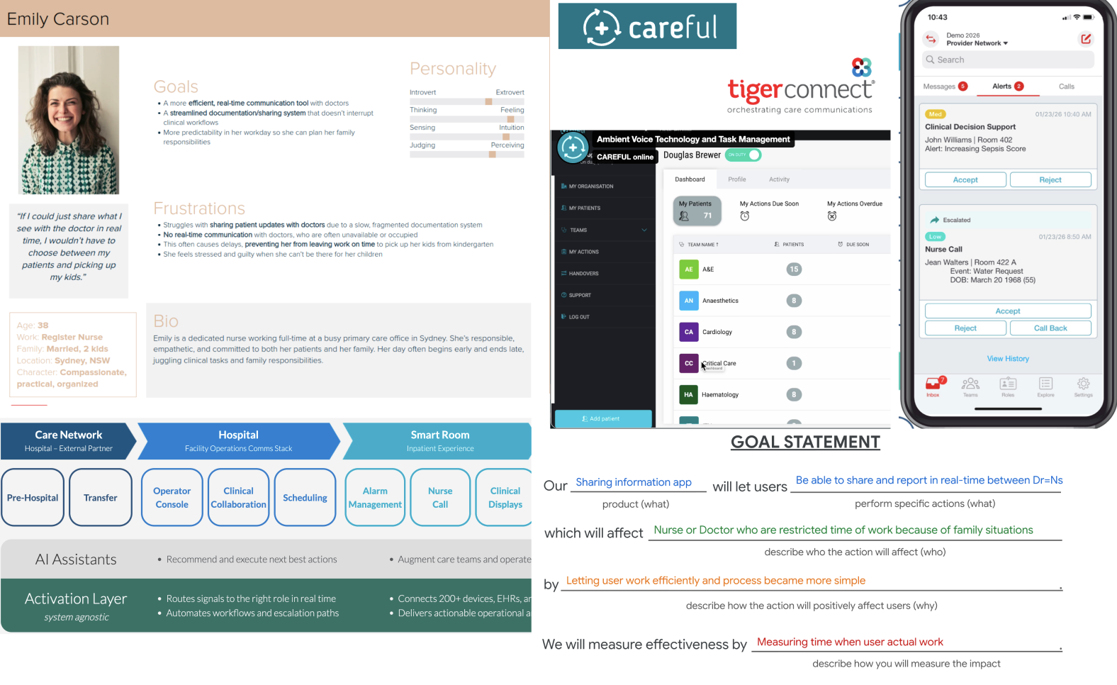
This project was completed as part of my UX Design course. Drawing on my previous experience as a nurse, I conducted research to identify real-world challenges in healthcare communication and designed a solution to address them.
Role
Product
Year
2025
Sector
HealthTech
Streamlining
Medical reporting
Healthcare professionals work in high-pressure environments and experience significant levels of stress. Long hours, night shifts, overtime, and challenges maintaining a healthy work–life balance often contribute to burnout, career changes, and early departures from the profession. At the same time, the healthcare industry has been slower to adopt modern technologies, making it difficult to improve efficiency and streamline communication.
Helping Healthcare Workers
Reclaim Their Time
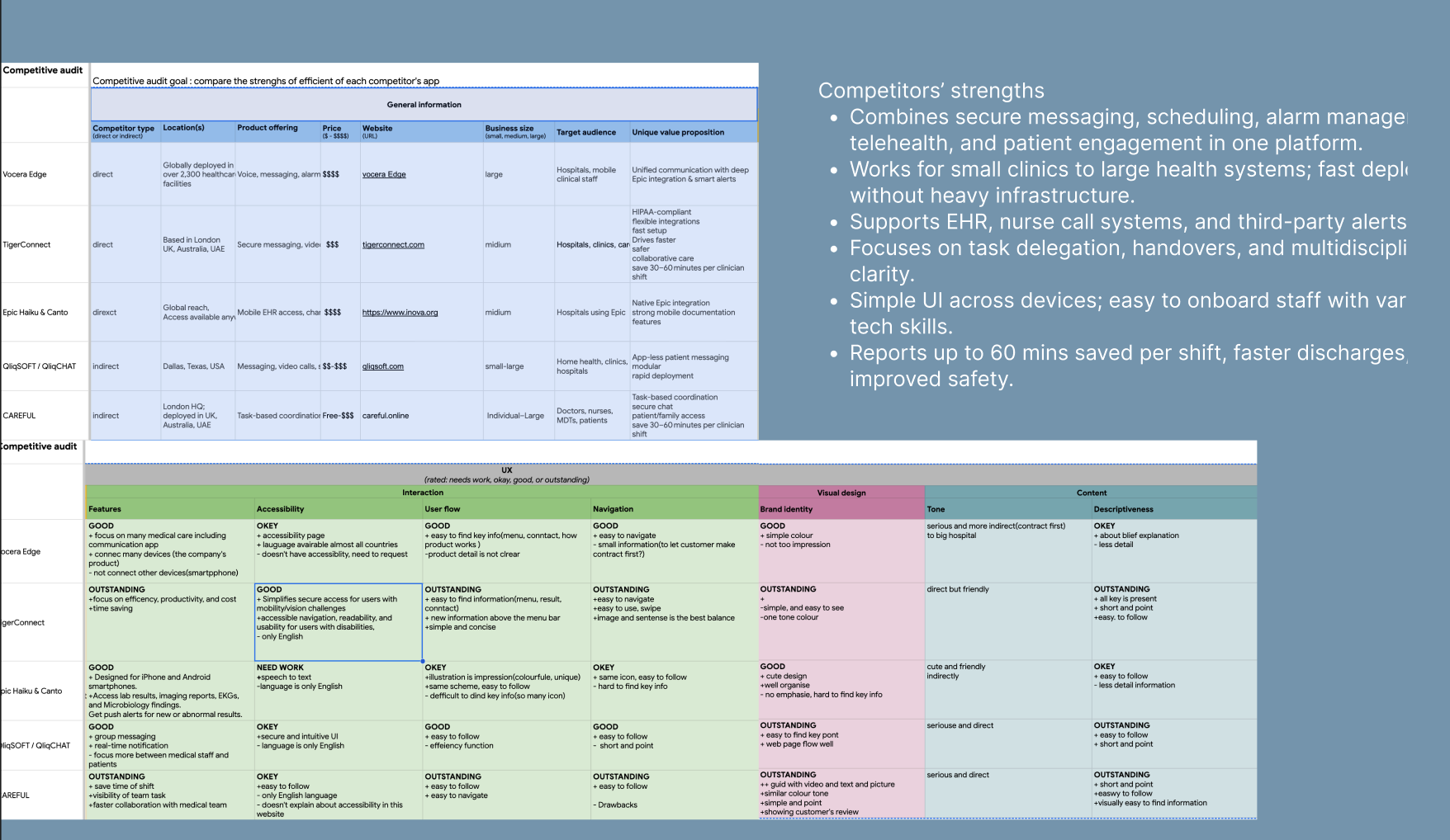
As I narrowed my research focus to nurses and explored their experiences in greater depth, I discovered that maintaining quality time with their families was a significant challenge. Overtime work often prevents them from picking up their children on time or spending meaningful time with their loved ones, adding to the pressures of an already demanding profession.
By improving workplace efficiency and reducing administrative burdens, healthcare professionals can spend less time on non-clinical tasks and more time on what matters most outside of work. Even small improvements in workflow can have a meaningful impact on their personal lives and overall well-being.
Why is work time longer?
Healthcare professionals often face overtime and burnout because no two days are ever the same. Unexpected emergencies can arise at any moment, and even the best plans can quickly be disrupted, creating constant pressure and stress in the workplace.
Streamling medical reporting
What if healthcare professionals could document information while they worked? What if they could quickly communicate updates to doctors or create accurate records without stopping their workflow?
Finding efficiencies
Documentation is often delayed because it does not directly impact immediate patient care. However, accurate record-keeping is essential for communication between staff. By integrating documentation into everyday tasks, healthcare professionals could complete their records as they work, reducing administrative burden and saving valuable time at the end of each shift.
Mapping the
flow.
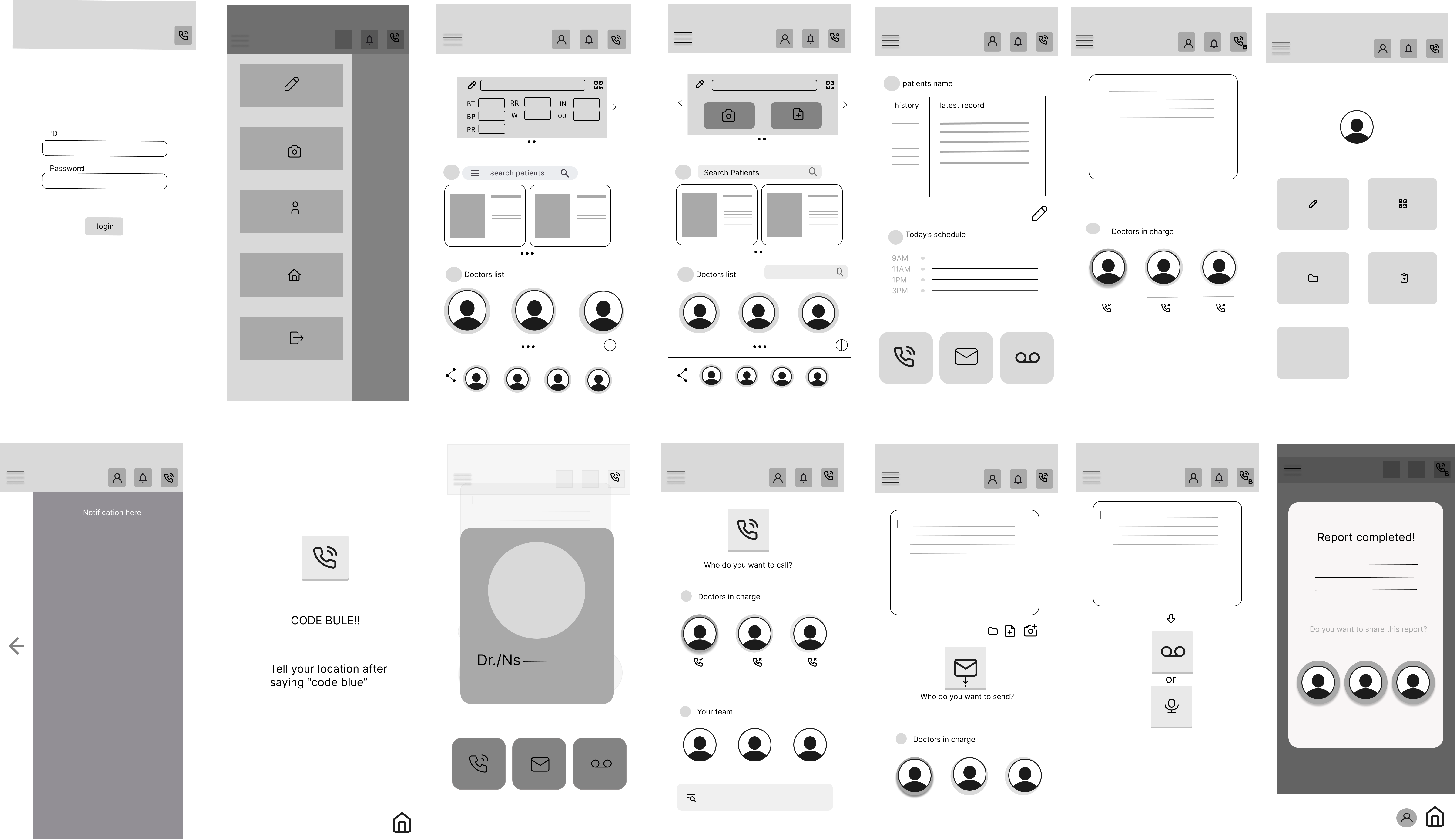
Final
interface.

Considering many
cases
While this was a conceptual project created for learning purposes, it reflects a challenge I experienced firsthand as a healthcare professional. I hope to one day contribute to building products that make a meaningful difference in healthcare.
Trained in
empathy.
Before transitioning into UX design, I spent nearly 10 years working as a nurse. That experience has been incredibly valuable in understanding and identifying user needs.
My experience has shaped the way I approach UX design today, especially when it comes to empathy, communication, and user-centered thinking. While my journey as a designer is still evolving, I hope to continue creating better products by combining my previous experience with a growing passion for thoughtful and meaningful design.
Capabilities
Certificate
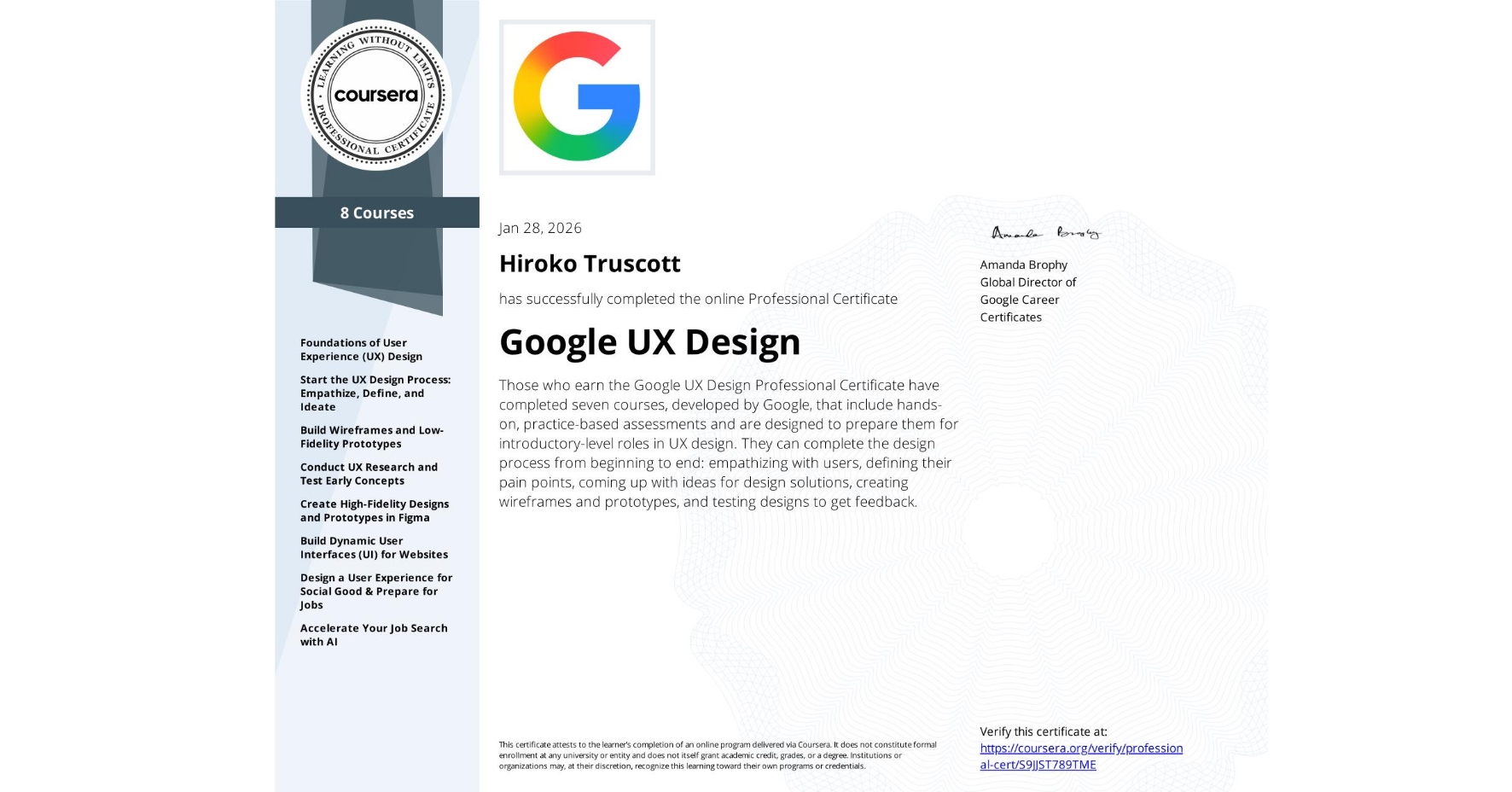
Google UX Design Professional Certificate — completed 8 courses covering user research, wireframing, prototyping, usability testing, and high-fidelity design in Figma.